Saved from 50 megs - site is unstable, images are missing on that site
Return
Home
Return to
Main
How-To
Page
Understanding Composition


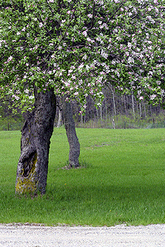
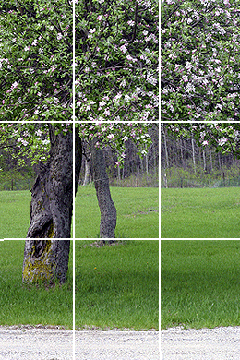
Photo © R.L. Herron The Rule of Thirds Photographic excellence, like beauty, is almost certainly in the eye of the beholder. But most of us would agree that composition is a primary factor in successful photography. While most pictures will usually fall into the “snapshot” category without it, you can probably find marvelous examples of commercial photography that have violated the rule of thirds and still accomplished something of extraordinary beauty. However, the rule-of-thirds guideline for subject placement has been the traditional way to create a well-balanced image – and has been taught to fine art painters for centuries as the way to create a dynamic composition. While getting ready to take your next picture, imagine your camera’s viewing screen etched with grid lines that divide it in thirds, both horizontally and vertically (imagine a tic-tac-toe grid). Place your main subject at one of the intersecting points, so your photograph will lead the viewer’s eye through the frame. Like the apple tree image above, even simple, static subject matter can be given a dynamic feel by using this technique. Experienced photographers often break compositional rules in order to make a point, or create a specific mood. But before you think about breaking the rules it is important to know, understand and practice the basics. 
 Photo © Jeffrey Michael Herron Dramatic Skies Dramatic skies can be emphasized by placing the horizon low in the frame, along the lower line of the imaginary grid. 
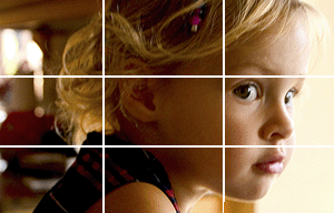
 Photo © R.L. Herron Large Subject In a portrait close-up, place the most important subject element – often the closest eye – at or near one of the top two intersecting lines. Other do-it-yourself repair or technique sections are listed below (note - line items in black are still under construction):
|
|
| © 2000-2005 R.L. Herron Saved for Historical Reference | |